Health Sciences Help

Built Environments 2: Health Indices & Proximity to Parks
Built Environment 2
Background
Increasingly in public health, mapping tools are being used to better understand where people live and the resources (e.g., parks) available to them within their communities. ArcGIS is one mapping tool that is available for examining the availability of resources as well as the demographic make-up of an area. ArcGIS can be used to identify high-risk populations to target for community health interventions. For example, the health status of low socioeconomic status (SES) communities is worse off than higher SES communities. Since income is a significant predictor of health outcomes, public health practitioners often use US Census Data to identify low SES areas for community-level health interventions. For this part of the built environment assignment, students will become familiar with ArcGIS.
Assignment
- Students will learn how to use the ArcGIS Online Business Analyst to select four parks and to describe the demographic and health status of residents near these parks.
Deliverables
- Submit a document (MS Word or PDF format) with a screenshot of your city with four parks labeled with the park name and whether the health status of the surrounding residents are HIGH, MEDIUM, or LOW.
 ArcGIS Business Analyst is a browser-based mapping app that applies GIS technology to extensive demographic, consumer spending, and business data, allowing you to map locations, perform analysis, and create reports and infographics. Esri updates the data periodically so that you have access to the most current and accurate data.
We are Analysts: As analysts, we are trying to determine whether proximity to park areas has an impact on the health status of the residents.
How do We Calculate Health Status? We will create a Health Index. In order to calculate a Health Index, we will need to each make 2 decisions:
- What criteria should we include?
- How important is each criteria?
We Will Use a Weighted Mean Calculation: A standard mean or average is adding all values and dividing by the number of values. A weighted mean multiplies a weight to each value so they are not all averaged equally. In GIS terminology, this is called Suitability Analysis.
Here is an example:
| Criteria | Value | Weight | Score |
|---|---|---|---|
| Residents Use Exercise Program to Help with their Diet | 10% of residents | .3 (30%) | 3 |
| Residents Make Sure they Exercise Regularly | 5% of residents | .15 (15%) | .75 |
| A Third Indicator | 15% of residents | .2 (20%) | 3 |
| A Fourth Indicator | 10% of residents | .35 (35%) | 3.5 |
| Health Index | 10.25 |
| Steps | Helpful Images |
|---|---|
| Head to ArcGIS Business Analyst using the same ArcGIS credentials you used to log into ArcGIS Online. |  |
|
If you are presented with a box to create a new project, create a new project. Otherwise:
(1) Make sure you are in the Home tab (2) Create a New Project |
 |
|
Name the project and click Create (will then take a moment)
Then click OK |
 |
| Click Open on the project just created |  |
| Find a basemap that works for you. |  |
| Steps | Helpful Images |
|---|---|
|
(1) Click Define Areas (2) Select Geography |
 |
| Select from Full List |  |
|
Select Census Tracts |
 |
|
Select your state Then Select your county
|
 |
|
Click the box next to Census Tract to select all tracts NOTE: Business Analyst can analyze a maximum of 1,000 tracts per project. If your county contains more than 1,000 tracts you will receive a popup that only the first 1,000 tracts will be analyzed. Click Continue if this happens. |
 |
| Click NO beneath. This is important! Then click |
 |
| Click Suitability Analysis |  |
| Select features on map |  |
| Click the BLUE Next | |
| Click Next |
| Steps | Helpful Images |
|---|---|
| Click Select Criteria/Add variables from data browser |
|
| Let's search for exercise |  |
|
Steps:
|
 |
| Click Explore to return |  |
|
Add 2 more variables (perhaps diabetes, income, education)?
|

| Steps | Helpful Images |
|---|---|
|
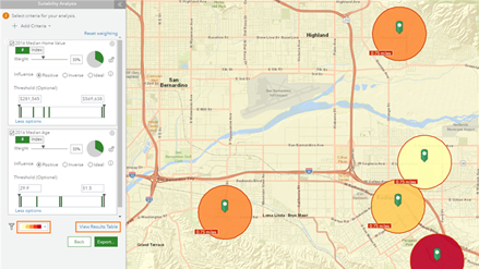
We need to set parameters on the Left before we can explore the results of our analysis.
Let's go ahead and minimize the bottom bar |
 |
| Decision #1: Positive or Inverse |
Decide for each criteria. If the criteria increases, will the health score increase? If so, then POSITIVE. Otherwise, INVERSE. |
|
Decision #2: Health Index Scale
|
 |
|
Decision #3: Adjust Weights
Click DONE when finished
|
 |
| Optional: Want to adjust color scheme? |  |
|
Click Filter Icon and drag the 0 bar on the left towards the right to filter out the lower scored items.
These are the highest scoring Census Tracts! Then click DONE |
 |
| Click Save Layer and then OK |  |
| Steps | Helpful Images |
|---|---|
| Click Add Data and select Web Maps and Layers |  |
|
Scroll down and expand Living Atlas
If you lose the Suitability Layer, click the project name on the top left (next to the hamburger link) and select the Suitability Layer and click Edit. |
 |
| In the legend, drag USA Parks to top |  |
| Adjust transparency of Sites Areas to approximately 35% to see parks beneath highest scoring areas. |
| Steps | Helpful Images |
|---|---|
|
Click a park to identify the park name Expand Attributes |
 |
| On far right, click the Add Annotation button to add a label for this park |  |
|
Type park name
Click Add to Map
If you encounter any problems moving an annotation, be sure to keep the Annotation window open. |
 |
| Move label to appropriate position | |
| Click empty area on map (with no annotation) before creating another annotation. | |
| Repeat for three more other parks | |
| Export to PDF |  |
|
Can't find the PDF? Expand project name and scroll all the way down and click CUSTOM MAP. |
 |
