Useful Links
All Purpose Data Visualization
Power BI
Tableau
Data Science Librarian

Liaison Subject Areas: Statistics, Computer Science
Areas of Support: Qualtrics, SPSS, Excel, DMP Tool. Quantitative and qualitative data analysis, statistics, research data management, survey design, research design.
Director of Data & Digital Scholarship

Overview
Data Librarians Joshua Been and Millicent Weber will lead two hands-on exercises to build interactive reports and dashboards using Microsoft Power BI and Tableau Public.
Homework: Share a Tableau Dashboard Visualizing Student-Generated Form Data
Submit a URL to a dashboard published on Tableau Public visualizing the data that the students from both sections of DSC 4320 (Spring 2025)
Steps:
- Download here[
- OPTIONAL] Clean & transform data (using Excel, Python, anything you are familiar with)
- Navigate to Tableau Public: https://public.tableau.com/ and log in
- Under Create, select Web Authoring
- Load data
- Create one tab (Sheet) per visual
- Create a dashboard and arrange visuals
- Add a Text object for a title
- Publish
- Share URL
Tableau Exercise
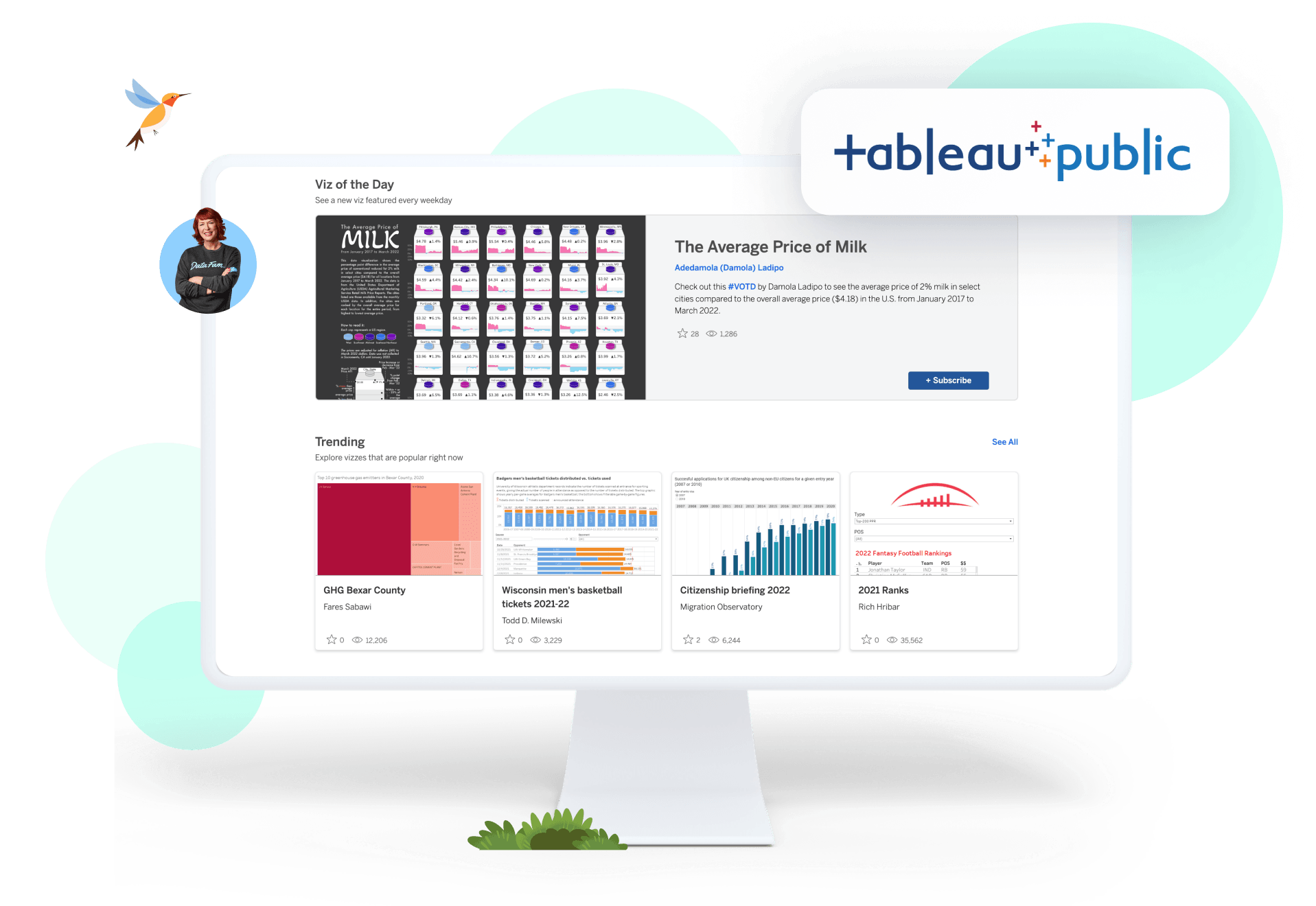
Tableau Public is a free online platform that lets users create, explore, and share data visualizations. It also has a large collection of data visualizations that users can learn from.

 Does a nation's economic prosperity (GDP per capita) significantly influence its success in the Olympic Games (total medals), and how does this relationship differ between Summer and Winter Olympics?
| Workflow Phase | Item |
|---|---|
| Data Source | https://libguides.baylor.edu/ld.php?content_id=80079129 |
| Data Model |  |
| One Visual per Tab |
Let's start with the following:
|
| Mini-Quiz! | Only show counts by gold medal. |
| What Other Visualizations to Address Research Question? |
Any of the following make sense here?
|
| Parameters & Calculated Fields |
Let's create a filter for Summer or Winter Olympic medal counts.:
|
| Mini-Quiz #2! | How would we adjust the Calculated Field to instead show medals per capita? |
| Dashboard & Publish |
Combine sheets into a dashboard and publish.
To make full screen, replace URL parameter (? and succeeding string) with the following: ?:embed=y&:display_count=no&:showVizHome=no#1 |
Power BI Exercise
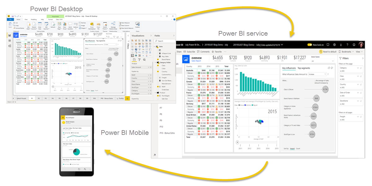
Power BI, which stands for "Power Business Intelligence," is a Microsoft software suite that allows users to connect to various data sources, transform and analyze the data, and visualize it through interactive dashboards and reports, essentially turning raw data into actionable insights for business decision-making; it's considered a powerful tool for business intelligence (BI) with user-friendly features for both technical and non-technical users alike

| Workflow Phase | Item |
| Data Source |
Excel Sheet Download & connect via local Excel Workbook |
| Preview & Explore via Visuals (optional step for learning) | |
| Power Query |
|
| Power BI Data Model | Set one-to-many cardinality from Id to Id, filtering in both directions. |
| Power BI Report |
|
| Publish to Service | All preceding steps and including this step are fully supported using the free version of Power BI. The following rows require Professional license. |
| Set Refresh |
|
| Share | Share Publicly |

